


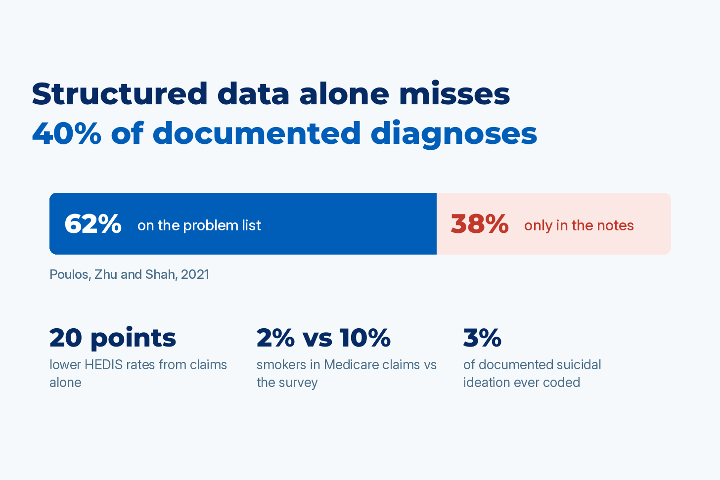
Every healthcare organization runs on measurements of its patients: which members have diabetes, which care gaps are open, how many patients smoke, how sick one hospital’s patients are compared with the hospital down the road. Nearly all of those measurements are computed from structured data, the fields software can read easily: diagnosis codes on claims, the problem list, lab results, medication orders. The rest of the record is unstructured: the notes, reports, and scanned documents that clinicians write and read, which is where most of what is known about a patient lives. Peer-reviewed studies that compare the two find that structured data alone misses almost 40% of documented diagnoses, two thirds of measured obesity, and 97% of documented suicidal ideation. All of that information is known and evidenced in the EHR, and the analytics never read it.
Why a missing code costs us
The damage from a measurement computed on half the record falls on three parties, and every figure in this section is documented with its source.
Patients
A patient whose lab results show chronic kidney disease but whose record carries no CKD diagnosis code is not in the CKD registry, does not trigger the nephrology referral, and is not on the list for the medications that slow the disease. In a Kaiser Permanente cohort below, that was 86% of the patients with the condition. A patient whose note says she has been thinking about suicide, but whose visit produced no matching code, is invisible to any prevention program that selects patients from codes; that was 97% of such patients in one primary care network. A smoker whose habit is recorded in the social history of every note and never coded is not offered cessation or lung cancer screening by any program that picks patients from claims.
Public health
Prevalence estimates built from claims report a fraction of the disease that exists. Medicare claims put current smokers at 2% when the survey of the same population put it at 10%, and the national inpatient dataset puts obesity at 15% while measured BMI puts it above 40%. Screening budgets, policy, and research built on those figures start from a number that is off by a factor of three.
Health plan finances
Health plans have known for two decades that quality rates computed from claims alone run about 20 points below the rates the chart supports, which is why they pay for an annual chart chase, and why Star ratings and pay-for-performance bonuses computed on the coded version understate the care that was delivered. Health systems in value-based contracts inherit the same gap, and Medicare Advantage plans carry it into risk adjustment audits, where the chart is the evidence and the code is the claim. In every one of these cases the information was in the record. It was missing from the part of the record the analytics read.
Analytics read the structured half of the record
The analytics stack that runs a health system, a payer, or a state Medicaid program is built almost entirely on structured fields, and everything downstream, from the HEDIS engine to the CMS-HCC risk model to the readmission dashboard, is SQL over those tables. That was a reasonable engineering choice when it was made: codes are standardized, computable, and cheap to query. In this piece, “codes” means the diagnosis and procedure codes that make up most of that structured data, and “the chart” means the complete record, structured and unstructured together.
The cost of reading only that half has been measured many times and rarely acted on. Veysel Kocaman, Dia Trambitas, and I built our AMIA Amplify 2026 session on regulatory-grade patient journey platforms around this evidence. A 2025 study in the Journal of Medical Internet Research took 1.8 million patients from a Dutch primary care database, extracted clinical concepts from the free-text notes, and checked how many had a structured counterpart in the same record. Thirteen percent did. The other 87% of what clinicians wrote about conditions, measurements, and drugs never became a code in that database. The studies below repeat that comparison one measure at a time, and every one of them finds the codes undercounting.
I’ve heard the anecdotal version at AMIA more than once: a state health data team whose claims show 5% of its members as smokers while the state’s own survey shows three times that. The peer-reviewed literature says that experience is typical.
Medicare claims found a fifth of the smokers surveys found
Smoking status is documented at nearly every encounter. It sits in the social history of every history and physical, on intake forms, and in nursing assessments, all of it unstructured text. It is also one of the facts least likely to reach structured data. A 2019 study in BMC Health Services Research compared tobacco diagnosis codes in Medicare claims against the CDC’s Behavioral Risk Factor Surveillance System for adults 65 and older. In 2001, claims identified 2.01% of beneficiaries as current smokers; BRFSS put the figure at 10.03%. By 2014, after a decade of quality programs and Meaningful Use incentives, the claims estimate had climbed to about 55% of the survey estimate, and the authors concluded that Medicare data still substantially underestimated tobacco use.
The sensitivity numbers explain why. A 2013 JAMIA study at Vanderbilt found ICD-9 tobacco codes had a specificity of 1.0 and a sensitivity of 0.32 in a general clinic population. The BMC authors note that this insensitivity is presumably why tobacco is left out of the standard claims-based comorbidity indices altogether. Smoking drives lung cancer screening eligibility, COPD and cardiovascular risk models, and the comorbidity adjustment behind outcome comparisons between hospitals, and a model that sees 2% smokers in a population where 10% smoke assigns the excess risk to something else.
The social history in the note holds the missing data, and that is the pattern this piece will repeat: the fact is documented, the code is absent, and reading the text recovers most of the gap.
Inpatient obesity is 42% by BMI and 15% by code
Obesity is the cleaner example because the reference standard is a number. Height and weight are stored as structured vitals inside the EHR, so BMI is computable there; the diagnosis code is what gets on the claim, and the code is what national datasets, payers, and most analytics see. A 2026 study in Obesity compared three national sources. The NHANES survey, which measures BMI directly, put adult obesity at 41.9%. NSQIP, which records BMI measured during a hospital stay, put inpatient obesity at 44.5%. The National Inpatient Sample, which relies on ICD-10 codes, put it at 15.4%. Any analysis that adjusts for obesity from claims, whether it is a hospital outcomes comparison, a GLP-1 utilization forecast, or a population health stratification, is adjusting for a third of the actual burden. This is a case where the evidence is already structured — but the code is missing anyway.
Diabetes codes miss a fifth and CKD codes miss half
Diabetes should be the best case for structured data, since it generates prescriptions, lab orders, and visits, all of which produce structured records. A 2013 meta-analysis in PLOS One of the standard claims definition still found it misses up to one fifth of cases, and inside the EHR the picture is worse. A 2014 study of 11.5 million US primary care records found that of 1,110,398 records with evidence of diagnosed diabetes, 61.9% contained a diagnosis code. Adam Wright’s 2015 study of ten health systems in three countries measured how often a patient with a diagnostic HbA1c had diabetes on the problem list: 60.2% at the lowest-performing site, 99.4% at the highest.
Chronic kidney disease is the extreme case, and the reference standard is a lab value. A Kaiser Permanente Georgia cohort of 10,266 patients with eGFR between 10 and 59 found 14.4% had a CKD diagnosis code, and a 2024 study of 60 English practices found 45.4% of eGFR-defined incident CKD in people with type 2 diabetes had a corresponding code. Every one of those patients had a creatinine result in the lab table. The code, which is what a registry, a risk model, or a care management queue keys on, was missing for half to six sevenths of them.
Administrative-only HEDIS rates run 20 points low
NCQA has known this for two decades — which is why hybrid measures exist. In 2007, authors from NCQA and the American College of Physicians published in the American Journal of Managed Care an analysis of 283 commercial plans reporting 15 HEDIS hybrid measures. Rates computed from administrative data alone were on average 20.4 percentage points lower than rates that added medical record review in 2004, and 20.6 points lower in 2006. For HbA1c testing and cholesterol screening, more than 60% of plans changed quartile rank once chart review was added. The authors concluded that administrative data alone did not provide sufficiently complete results for ranking plans on those measures.
That gap is the reason for the annual chart chase, in which plans draw samples of 411 records per measure and abstract them by hand. NCQA is now retiring hybrid reporting in favor of Electronic Clinical Data Systems, which add EHR, registry, and health information exchange feeds to claims. The move helps and does not close the gap. NCQA’s own October 2025 report on ECDS results found that for measurement year 2024, hybrid rates were still higher than ECDS rates by 3.4 percentage points for commercial plans and 5.5 for Medicaid plans. ECDS reads structured fields. Whatever the clinician wrote and never coded is invisible to it, and the plan pays for that twice: in outreach to members whose gaps were closed in a note that never produced a claim, and in Star ratings and incentive payments computed on a partial numerator.
Problem lists hold 62% of what the notes document
Pull back from individual conditions to the problem list, the structured summary of a patient’s diagnoses that most analytics treat as the truth, and the number in this article’s title appears. In 2021, Poulos, Zhu, and Shah at a London teaching hospital, one year after a full Epic implementation, manually reviewed the free-text notes of 516 patients with suspected or confirmed COVID-19. The patients’ problem lists held 2,841 diagnoses. Chart review found 1,722 more, raising the mean per patient from 5.51 to 8.84. Overall, 62.3% of diagnoses were on the problem list, and the remaining 37.7% existed only in the notes.
The pattern holds across the specific kinds of information that analytics programs depend on:
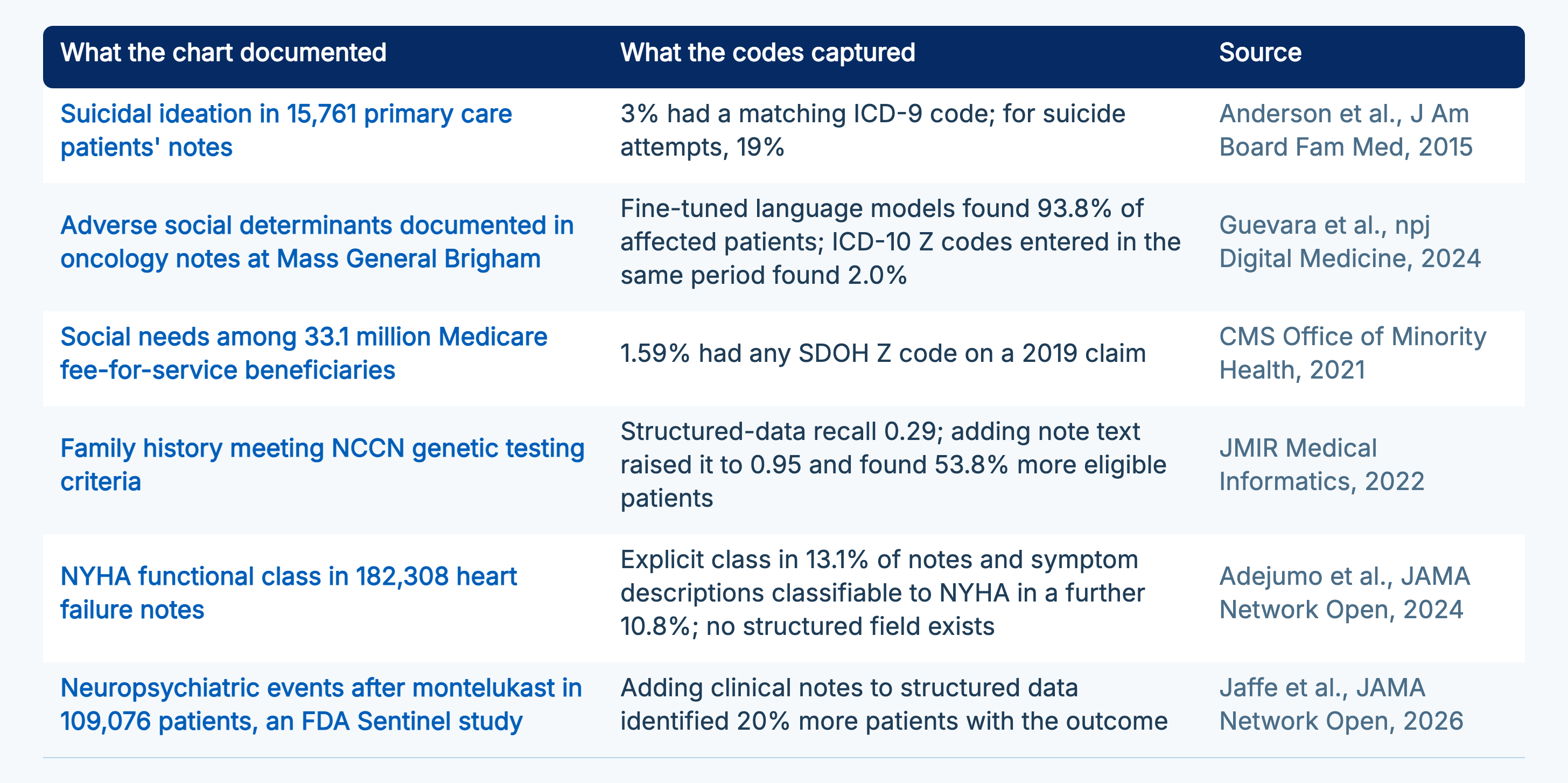
Sources: Anderson et al., J Am Board Fam Med, 2015; Guevara et al., npj Digital Medicine, 2024; CMS Office of Minority Health, 2021; JMIR Medical Informatics, 2022; Adejumo et al., JAMA Network Open, 2024; Jaffe et al., JAMA Network Open, 2026.
Each row is a decision that analytics built on structured data alone gets wrong: a suicide prevention program blind to 97% of documented ideation, a population health team stratifying on social risk it can see in 2% of members, a heart failure quality program with no computable functional class, a hereditary cancer program reaching under a third of eligible patients.
Structured data records billing behavior as much as disease
The reason these gaps are so consistent is that a code, the unit of most structured data, is produced at billing time, under coding rules, claim-line limits, and reimbursement incentives, by someone whose job is to bill the encounter correctly. It records that a coder chose to code something. A note records what a clinician observed.
Huo and colleagues, in Value in Health, showed how far the two can drift: over six years, the proportion of patients coded as current smokers in one claims database rose 2.3-fold and former smokers 4-fold, an increase the authors attribute to Meaningful Use requirements to record smoking status, and the sensitivity of any single ICD-9 smoking code stayed under 10% throughout.
For anyone computing a metric, the implication is simple. The presence of a code is decent evidence that a condition exists. The absence of a code is weak evidence that it doesn’t. The chart, with its notes, reports, and lab values, is the record of what was observed, and it is the reference standard every study in this piece used to grade the codes.
Ambient scribes grow the note faster than the codes
Ambient scribes make notes longer. In the Penn study of 46 clinicians published in JAMA Network Open in 2025, time in notes fell 20.4% per appointment and note length rose 20.6%, and a 2025 rapid review in JMIR AI listed reduced documentation time with longer notes as the first consistent theme across real-world evaluations.
The study that connects the longer note to the missing code is Castro and colleagues in JAMA Psychiatry, published in January 2026. They took 20,302 primary care annual-visit notes from Mass General and Brigham and Women’s, matched AI-scribed visits 1:1 to human-scribed, contemporaneous unscribed, and pre-deployment visits, and measured neuropsychiatric symptom documentation with a language model. AI-scribed notes documented significantly more symptoms in all six research domains. The odds that the visit produced a psychiatric intervention, defined as a referral, a new diagnosis code, or an antidepressant prescription, were lower: an adjusted odds ratio of 0.83 against contemporaneous unscribed visits, with human scribes at 0.97. More written down, less coded and less acted on, in the same visit.
The coding side moved too, in the direction the vendor’s coding module points. When Texas Oncology piloted DeepScribe with 49 physicians, billed diagnoses per encounter rose from 3.0 to 4.1, with the gain concentrated in non-cancer HCC codes. A December 2025 policy brief in npj Digital Medicine documents Cigna responding on October 1, 2025 by automatically reducing many mid- and high-level E/M claims by one level unless the documentation supports the code. The narrative grows on every axis because the microphone captures the whole conversation. The coded output grows only on the axis a billing module was built to find, and the payer now adjudicates that code against the note.
No published study has yet measured the share of documented conditions that reach a code before and after ambient adoption. Castro is the closest and it points the way you would expect. The record of what was observed is growing at 20% a note, and analytics that read only the codes are reading a shrinking fraction of it.
A complete measure reads every evidenced fact in the chart
Structured data stays in the measure. The change is to stop treating it as the census when it is a sample. A complete measure is computed over structured and unstructured data together: the codes, the labs, the vitals, and the facts extracted from notes and reports, each one traced to its source. That is what John Snow Labs means when it says a measure should use all the known, evidenced information about each patient.
Doing that at production scale has requirements the research prototypes above mostly did not have to meet:
The extraction has to run at regulatory-grade accuracy on your documents, validated against clinician-annotated ground truth.
It has to resolve assertion status, because “denies chest pain,” “family history of diabetes,” and “history of PE, resolved” all contain the term without the condition.
It has to handle copied text and temporal context, because Wang and colleagues in JAMA Internal Medicine in 2017 found only 18% of the text in 23,630 inpatient progress notes was newly typed, so a fact repeated in twenty notes still happened once.
It has to carry provenance and a confidence score with every fact, so a reviewer can click from the result to the sentence and a low-confidence finding can be routed to review instead of counted silently.
It has to run inside your environment, because the input is the identified chart.
The measure logic on top should stay deterministic: the model extracts and normalizes facts, and SQL decides whether the patient meets the numerator.
That is the design behind John Snow Labs’ clinical measure and HCC coding pipelines: medical language models extract and normalize the facts with evidence links, deterministic logic computes the measure, and reviewers see the source text behind every result. Where money or a care decision rides on the output, a credentialed coder or a clinician makes the call, with their decision recorded and audit-ready. The model widens what they can see while the decision stays with them.
Run one measure both ways this quarter
The fastest way to find out what your analytics are missing is to reproduce one of these studies on your own data. It takes one measure, one year of records, and one analyst:
Pick the measure that carries the most money or the most attention in your organization: the hybrid HEDIS measure with the worst rate, the smoking or obesity variable in your risk model, the social risk screen your population health team stratifies on.
Compute it from codes, the way you do today.
Compute it again from the full chart on the same population, with extraction validated against a reviewed sample.
Write down the difference. The literature says it will run from 20 percentage points on a quality measure to a threefold gap on smoking or obesity, and it will not shrink on its own: ambient scribes are adding to the notes at 20% a visit, and the codes follow only where a billing rule sends them.
Take that number to whoever owns the decision the metric informs: the quality committee, the CFO, or the population health lead.
The delta is the measurement error in every gap-closure list, Star rating projection, and cohort your organization built on the coded version, and it is the business case for computing the measure from everything the chart contains. If you run it and want to compare results, the comments are open. If you would rather have it run for you, John Snow Labs does exactly this inside your environment, on your own notes, with the evidence behind every extracted fact.
Frequently asked questions
Isn’t the missing information mostly undiagnosed disease that nobody wrote down?
No. Every study cited here used documentation that already existed in the record as the reference standard: a diagnostic HbA1c or eGFR in the lab table, a measured BMI, or a diagnosis written in a note. Undiagnosed disease is a separate problem with its own literature. The gap measured here is between what clinicians documented and what got coded.
Why not fix the coding instead of extracting from notes?
Coding does improve with incentives. Wright’s ten-site study found the best-performing sites reached 99.4% problem list completeness for diabetes using financial incentives, problem-oriented charting, gap reporting, and links to billing codes. The worst site was at 60.2% with the same tools available. Medicare smoking codes went from a fifth of the survey rate to about half over the thirteen years that included Meaningful Use, and no further. Coding is a billing activity done under time pressure, and three decades of incentives have not turned it into a clinical census. Extraction reads what the clinician already wrote and does not ask them to write it twice.
Does NCQA’s move from hybrid to ECDS measures solve this?
It reduces the gap and does not close it. ECDS adds EHR, registry, and HIE data to claims, and NCQA’s October 2025 report still found hybrid rates 3.4 percentage points higher than ECDS rates for commercial plans and 5.5 points higher for Medicaid in measurement year 2024. ECDS reads structured sources. Facts that exist only in notes can be brought into ECDS as supplemental data once they are extracted and validated, which is how the two approaches fit together.
Can a general-purpose LLM read the notes and fix this?
Reading is the easy part. The hard parts are accuracy on clinical text at the level a quality auditor or RADV reviewer will accept, assertion and temporal handling so that “denies,” “history of,” and copied text are not counted as active conditions, provenance back to the source sentence, and running on identified PHI inside your own environment. General-purpose models have trailed healthcare-specific models on published clinical extraction and de-identification benchmarks, and the per-token pricing of frontier APIs makes reading every note for every patient expensive at population scale. I covered the cost side in the June cost model.
Do ambient AI scribes make this better or worse?
They make the note longer and the gap wider unless something reads the note. Ambient notes run about 20% longer than typed ones, and in the JAMA Psychiatry study of 20,302 visits they documented more psychiatric symptoms while producing fewer diagnosis codes and interventions. Where vendors route note content into billing, coded diagnoses per encounter rise, but only for the billable subset, and payers have begun downcoding against the documentation. Everything else the scribe captured stays in free text. The fix is the same as for the rest of this piece: extract the facts from the note with validated accuracy and provenance, and compute the measure over all of them.
How do I test this in my own organization?
Take one measure you already report and one year of data. Compute it from codes. Then run validated extraction over the notes and reports for the same patients, review a random sample of the extracted facts against the source text, and recompute the measure over the union of coded and extracted facts. The delta is your measurement error for that metric, and it will tell you which of your quality and population health numbers to trust.